Project Name & Type
Horizon Website / client redesigning website
Main Role
UI & UX Designer
Tools Used
Figma
FigJam
Notion
Timeline
May - August 2025
The overview
01
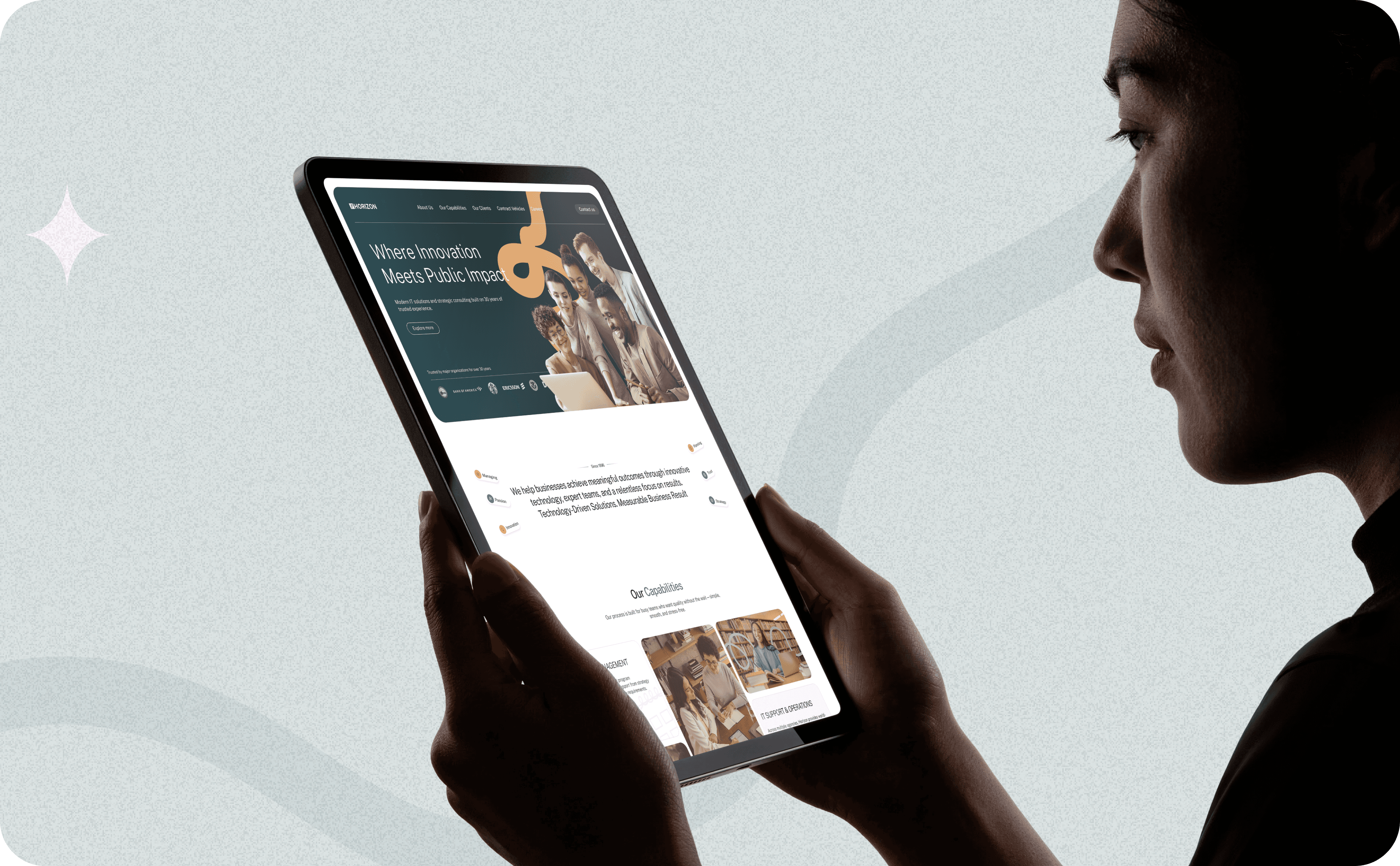
Horizon Industries is a U.S. government contractor with over 30 years of experience—but their website didn’t reflect that.
The site felt outdated, inconsistent, and hard to navigate. It lacked storytelling, visual cohesion, and structure—making it difficult for job candidates, partners, and government stakeholders to get a clear sense of who Horizon is and what they offer.
They needed more than a website facelift. They needed a user-first experience that felt professional, modern, and trustworthy.
The challenge
02
Improving clarity, structure, and the overall digital experience.
Outdated and inconsistent website experience
Unclear navigation and content structure
Weak visual identity and branding
Balancing professionalism with modern design
Full UX research
The goal
03
Modernize the overall experience
Improve content clarity and navigation
Strengthen Horizon’s digital presence
Create a more professional and trustworthy brand image

The approach
04
The redesign approach focused on simplifying the user experience through a clearer site structure, modern visual system, and more intuitive navigation. The goal was to create a professional and trustworthy experience that feels both modern and easy to navigate.
Starting with the right questions
05
Before jumping into design, I took a step back to understand the problem more deeply. This approach helped me ground decisions in real user needs rather than assumptions, and it started by asking questions like…
What is the clearest path for users to achieve their main goal on the site?
Who is the primary user and what do they need most from this experience?

What information is essential, and what can be simplified or removed?
The plan
06
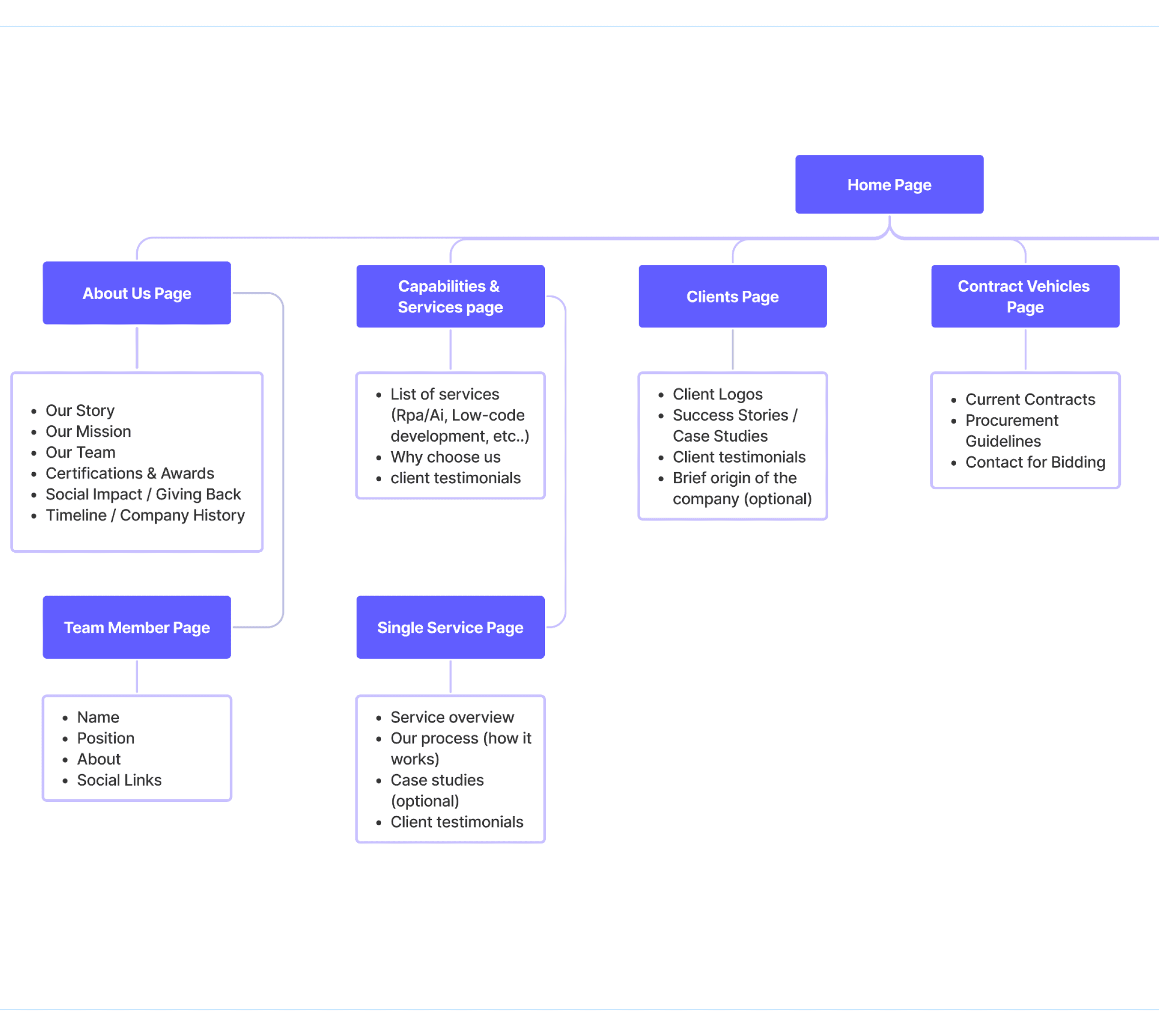
Flows and Wireframes
07
Before moving into the visual direction, the focus was on shaping how the website communicates — structuring the content, defining the storytelling flow, and guiding users through the experience in a way that feels clear, engaging, and easy to follow.

Visual style
08


Public Sans
Barlow condensed
Aa
font
side note: horizon didn’t really have a branding guidelines
so i did three quick moodboards / mini structure quidlines
for the client to choose from


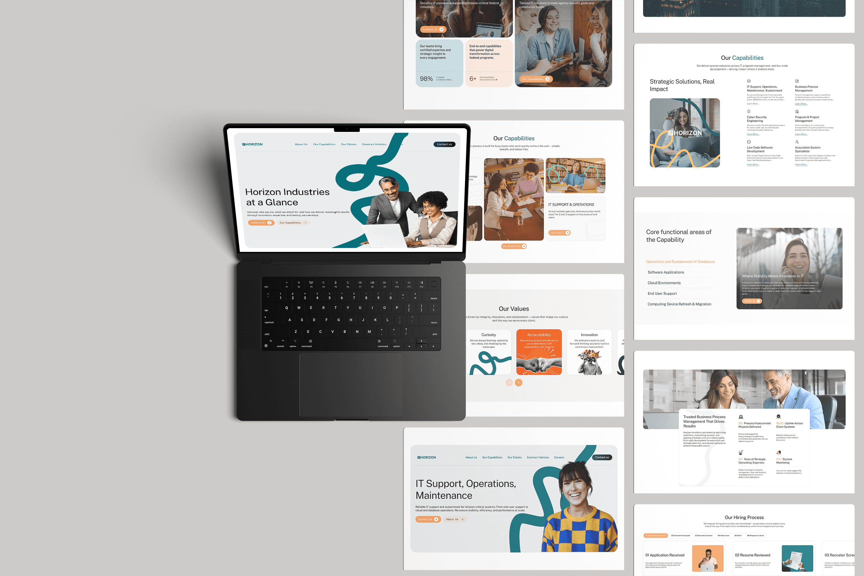
Scope of work
Comprehensive UX/UI Design: Over 10 unique pages, including Full UX research, wireframes resulting UI screens with a visually appealing flow.
Responsive Design: Ensuring the website's user experience is optimized across all devices, from desktop to mobile.
Collateral Design: Creation of key brand assets such as app design, email design , assessment design and other stationery to establish a consistent professional appearance.
Design system: A detailed guide outlining the proper usage of logos, colors, typography, and visual elements to maintain consistency across all elements.
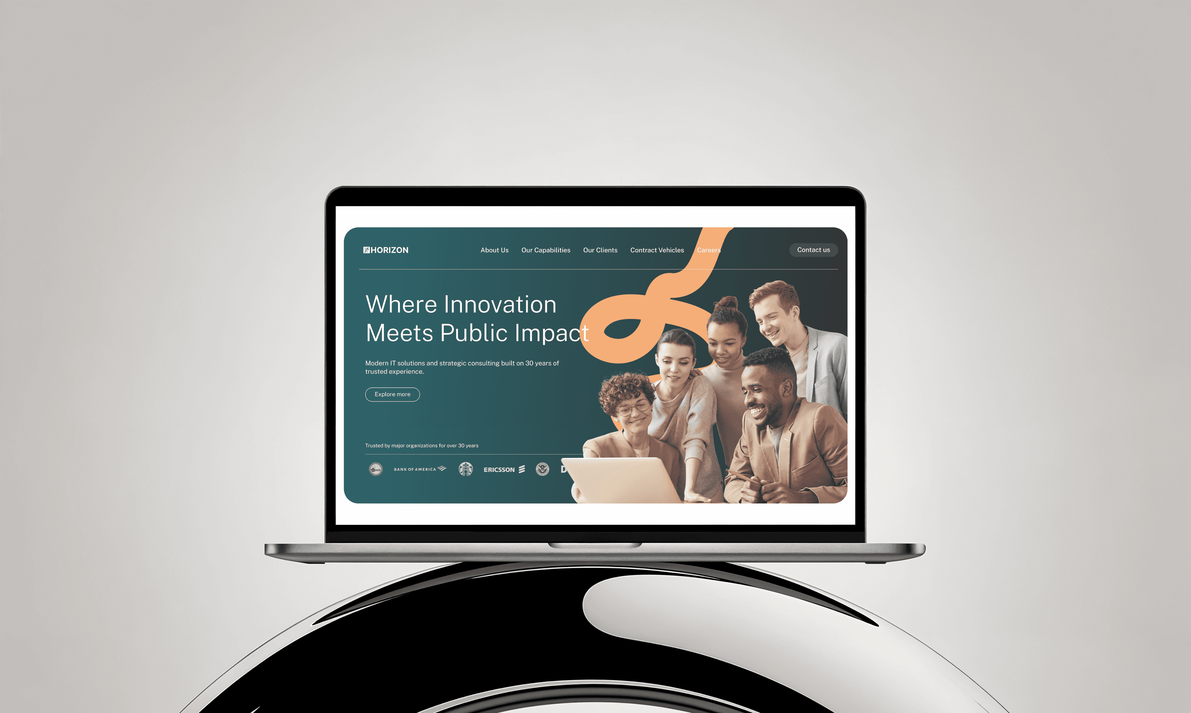


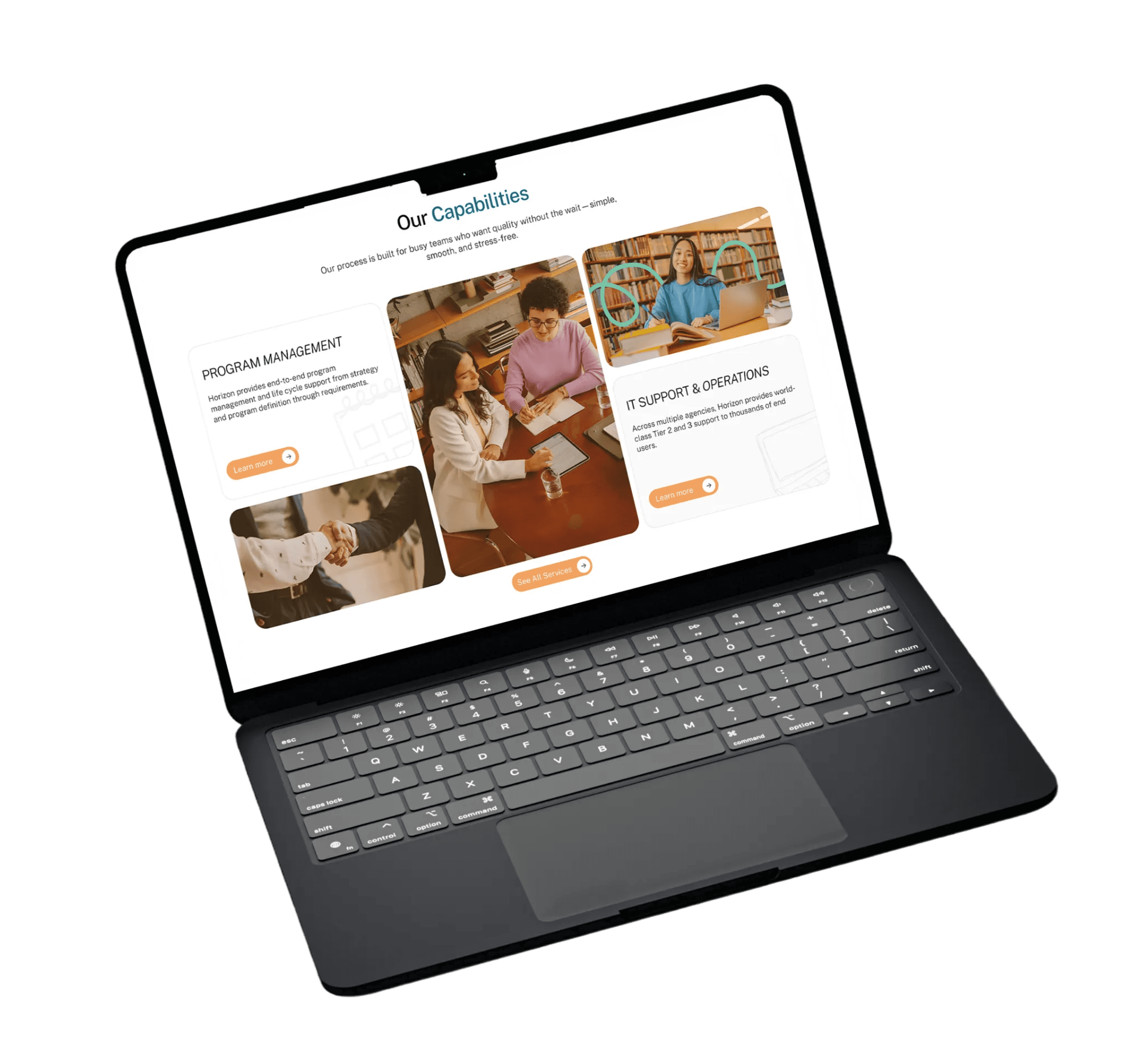
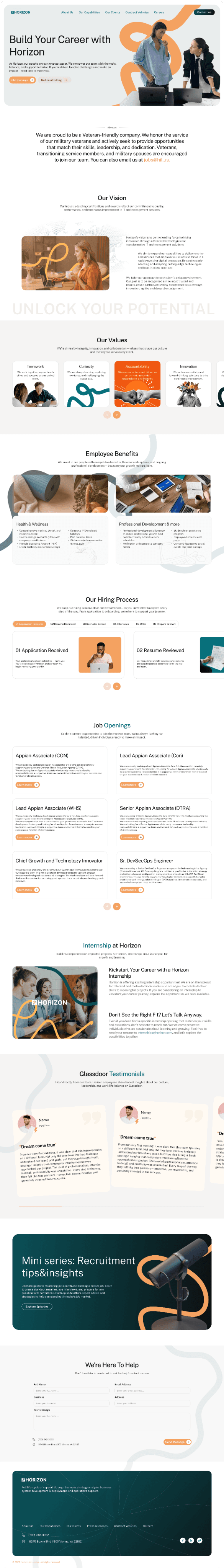
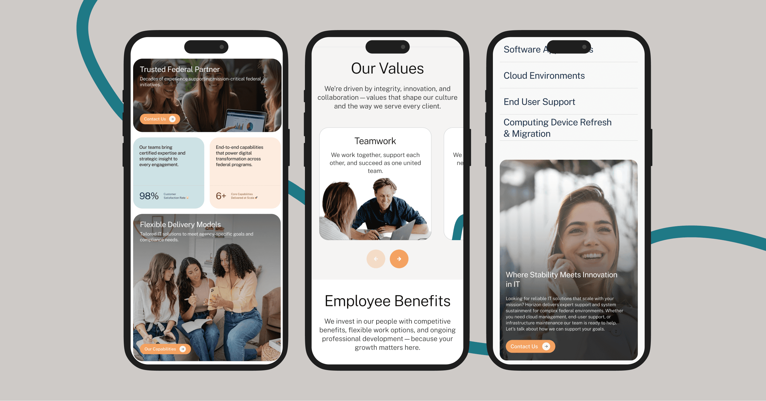
UI / UX design
The UX/UI design for the Horizon website focused on translating the product into a clear and engaging digital experience. The website was designed to communicate Horizon’s value in a simple and structured way, guiding users through the platform’s features, workflow, and benefits while reflecting the brand’s bold, colorful, and playful identity.


and more and more endless screens left.. :)

anyways thanks for sticking through this !!!!