
Mohtawa website
Building a clear and engaging digital experience for an AI-powered content creation platform.
Project Name & Type
Mohtawa Website / client product website design
Main Role
UI & UX Designer
Tools Used
Figma
Timeline
Feb 2026
The overview
01
Mohtawa is a modern content creation platform designed to empower agencies, creators, and brands to plan, produce, and manage high quality content using AI-driven workflows. The platform streamlines the entire content lifecycle from ideation to execution through an intuitive interface and structured automation.
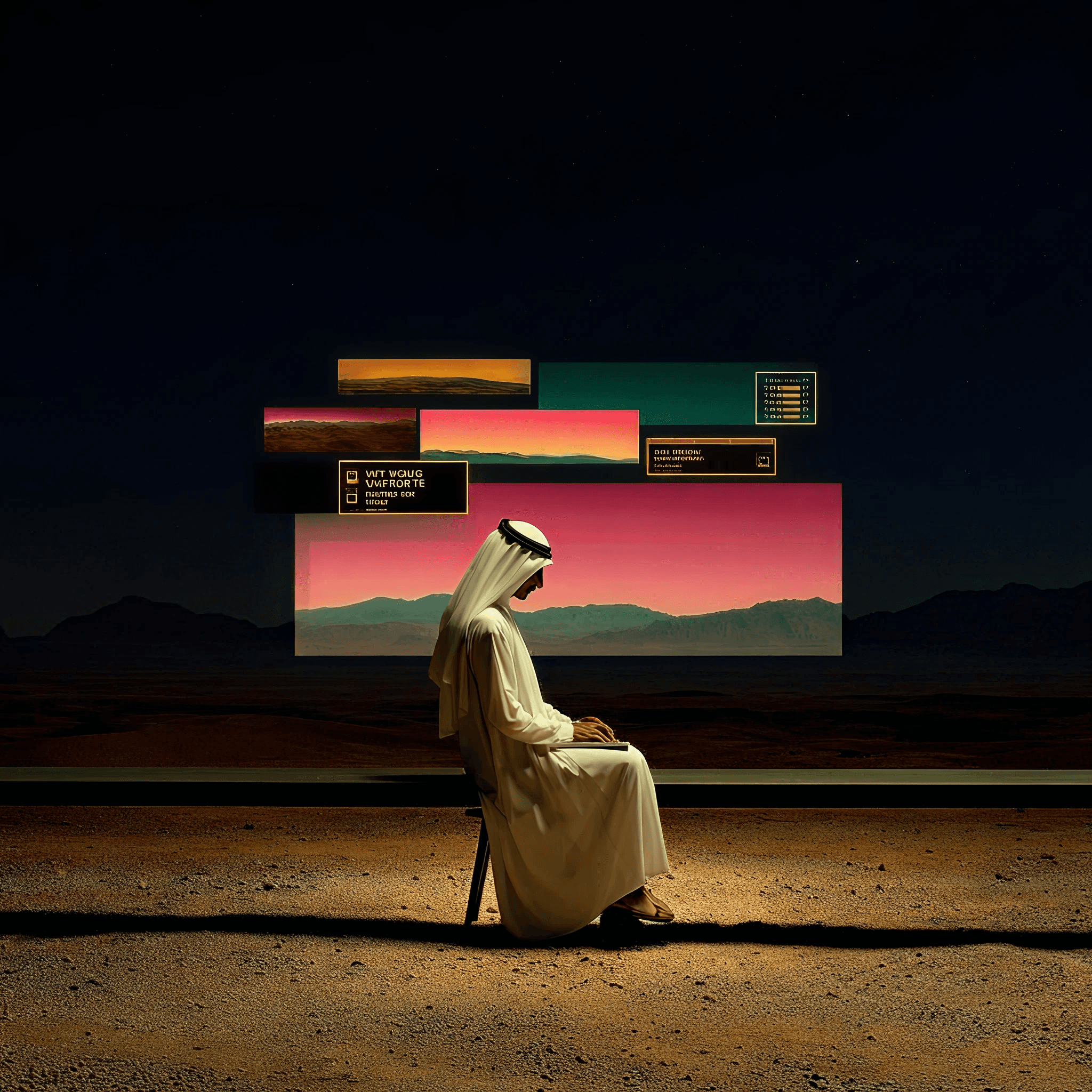
The website design reflects this vision through a sleek, futuristic aesthetic, using dark themes and neon accents to emphasize innovation and technology. Each section of the site communicates clarity and purpose: showcasing the product, explaining workflows, and highlighting key features that support scalable content production.
The challenge
02
Unlike the platform, the challenge here isn’t functionality — it’s communication.
Simplifying complex AI workflows
Balancing innovation with usability
Creating a clear content hierarchy
Presenting information without overload
The goal
03
Communicate platform value clearly
Streamline the user experience
Highlight key features
Build a modern digital presence

The approach
04
The design approach focused on making a complex AI-powered platform feel clear, approachable, and easy to navigate. Through structured layouts, visual hierarchy, and a modern interface, the experience was crafted to communicate Mohtawa’s capabilities while maintaining clarity and usability.
Starting with the right questions
05
Before jumping into design, I took a step back to understand the problem more deeply. This approach helped me ground decisions in real user needs rather than assumptions, and it started by asking questions like…
How can the website reflect the brand’s bold personality while keeping the product understandable?
How can we explain mohtawa clearly without overwhelming users?

How do we make the website feel engaging while still being easy to navigate?
Visual style
06


Crake test
Barlow condensed
font

Scope of work
Comprehensive UX/UI Design: Over 6 unique pages with a visually appealing flow.
Responsive Design: Ensuring the website's user experience is optimized across all devices, from desktop to mobile.
Collateral Design: Creation of key brand assets such as app design, email design , assessment design and other stationery to establish a consistent professional appearance.
Design system: A detailed guide outlining the proper usage of logos, colors, typography, and visual elements to maintain consistency across all elements.


UI / UX design
The UX/UI design for the Mohtawa website focused on translating the product into a clear and engaging digital experience. The website was designed to communicate Mohtawa's value in a simple and structured way, guiding users through the platform’s features, workflow, and benefits while reflecting the brand’s bold, colorful, and playful identity.


and more and more endless screens left.. :)
anyways thanks for sticking through this !!!!